Photography, artwork and music videos for The Road Less Travelled, a new album from Horse McDonald.
Horse’s new album, The Road Less Travelled, has been many years in the making. In fact, it’s her first release since 2013’s Home which was the first project I worked on with Horse. In the decade or so since, we’ve become frequent collaborators and close friends. With years of projects under our belt and the trust that came with that, Horse let me have the reigns of the visual side of the new album as well as its promo - from photography and video for the Kickstarter crowdfunding campaign, album artwork and vinyl packaging to various merchandise pieces. I even managed to have a small hand in the recording process and sang backing vocals on one of the album tracks (that’s one off the bucket list!).
The first piece of The Road Less Travelled rollout was the music video for “Leaving”, released back in 2022. In the 2 years since, Horse has completed writing and recording the album and everything was in place for a late spring 2024 launch. Late last year, we started brainstorming ideas for the album promo and for the album’s title track video. While the song “The Road Less Travelled” deals with a relationship ending, we decided to treat the title as a metaphor for Horse’s life, incorporating various iconic images from her 3-decade-plus career as well as personal snaps.
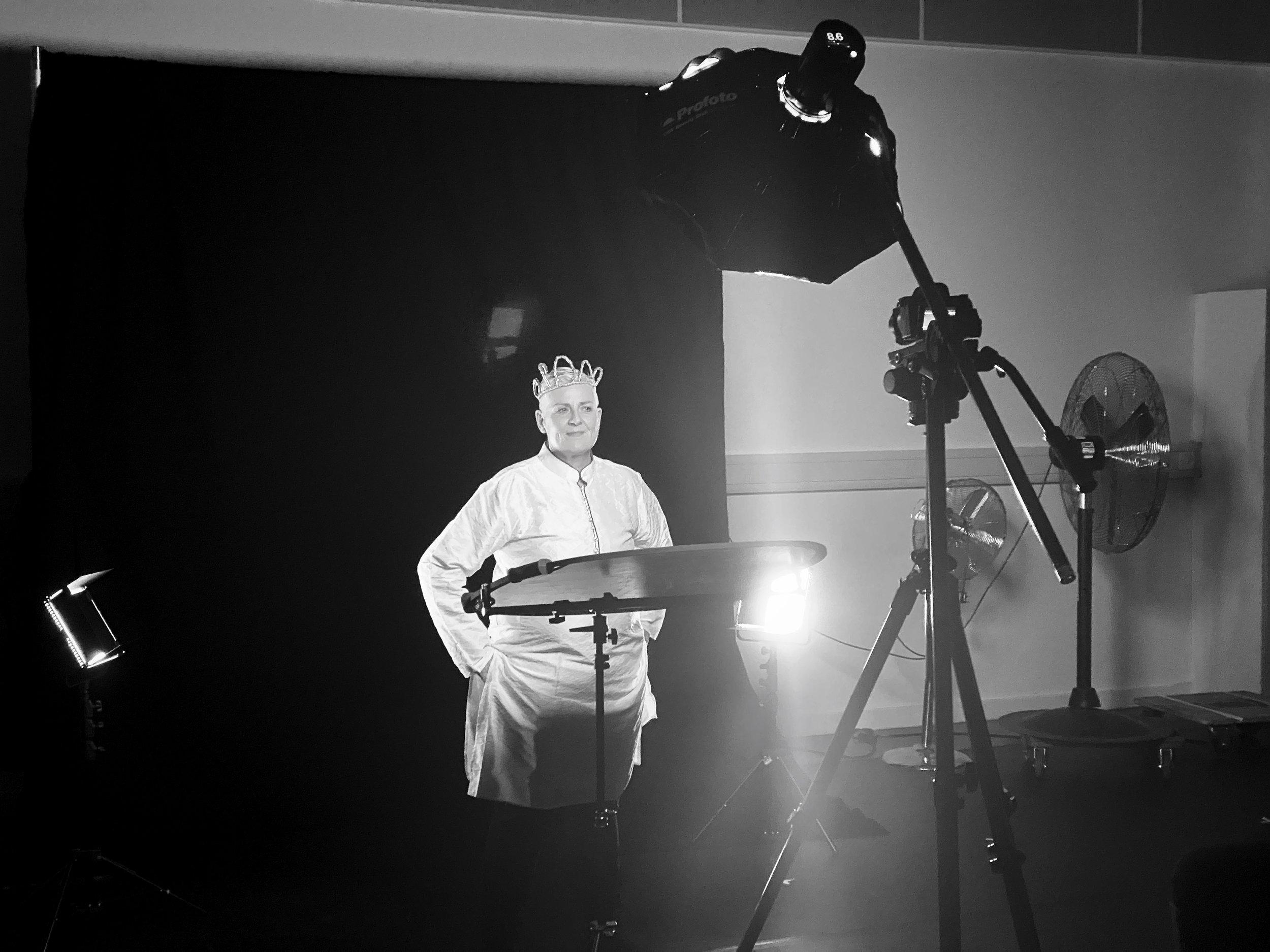
As for the album cover image itself, in late February we booked Basement49 studio and spent a few hours trying different things out. Originally, Horse wanted the album cover to echo the artwork for her 1990 debut, The Same Sky. I wasn’t overly keen on that idea - felt it was pushing the nostalgia factor a step too far - but in the end, it’s my job to bring the artist’s vision to life. The way I often tend to work, however, is to give clients what they think they want but also provide them with something they didn’t know they needed. In this case, what Horse didn’t think she needed was the very last image taken that day which, according to her, turned out to be as iconic as that 1990 shot. I can’t take full credit here though. Originally, my idea for this particular shot was to photograph Horse from the back, showcasing her distinct hairstyle from that angle, but our stylist, Michelle Watson, kept telling Horse to turn her head back to the left and that was that. When Horse received the contact sheet with the images taken on the day, that very last frame was her first choice for the album cover.
Scroll below for the videos, promo images, photos from the album launch at CCA and the album artwork.
ALBUM COVER SHOOT:
Styling & Make Up: Michelle Watson Creative
ALBUM LAUNCH AT CCA:
VINYL ARTWORK:
Limited, hand-numbered edition on red vinyl, gatefold with 12” x 12” exclusive insert


ALBUM LAUNCH BOOKLET:


